Space A
Design of a mobile app to help military service members take advantage of an underutilized benefit
Overview
About the Project
Space Available Travel (Space-A for short) is a benefit provided to US Service members that allows them to take seats on military cargo planes for free as a cheap means of travel during their service leave. During my time at General Assembly's user experience design imersive program I worked on a design for an app that would help to streamline the antiquated process of accessing this benefit.
What I did
- Created wireframes mockups
- Plotted users flows for the form submission process of booking flights
- Conducted user research at a US airforce terminal to learn from the staff and current users of Space-A
Goals
- Create a centralized portal to view flights from all terminals
- Allow users to fill out a request form online
- Provide users with more accurate information on whether they will be able to get onto their chosen flight
Challenges
- There are no guarantees with Space-A since the primary purpose of these flights is to transport cargo.
- When dealing with any military program, security and privacy are extremely important
- Interviewing current users can be difficult since the terminals used are on secure military bases
Phase 1: Research the Problem
We began this project with the basic understanding that the process for utilizing Space Available Travel was outdated and difficult, but we still needed to find out what parts of the current system were problematic and how potential users could be better served. In order to accomplish this, we completed two pieces of research:
- Usability tests of the existing process
- Interviews with previous users, potential future users, and the staff who run the program.
Usability testing to the existing process
The purpose of this usability testing was to understand if new users were able to understand the process as it was, and if not, how we might be able to solve their pain points. Essentially, we wanted to validate our problem and to give ourselves a jumping off point for our own work. Testing consisted of 5 participants who were not familiar with Space-A beforehand. We gave them a basic description of what Space-A was and provided them a link to the website where Space-A is managed, which is called Air Mobility Command. They were instructed to learn how apply for travel and to find a flight near them.
Key Insights
- Users find it difficult to scroll through the large amount of text on the site.
- Users find the sign up process very difficult.
- Users find it difficult to find flight schedules.
- User do not trust the Space-A site.
User Interviews
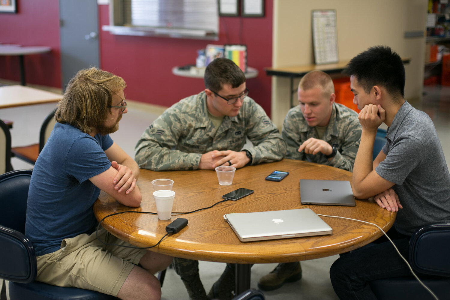
We spoke with 7 people during the course of our interviews: 4 active duty service members at recruiting centers, 1 veteran at the USO, and 2 employees at the passenger terminal at Joint Base McGuire in New Jersey. All but one of the people we interviewed had used Space-A in the past. Through these interviews we wanted to find out:
- What people already enjoyed about Space-A
- Problems they faced using the current website
- Issues they faced at the terminals
- Reasons they might not use the service again
- Common website-related problems employees faced at terminals
Insights from active duty
We found that all of those we interviewed were quite fond of Space-A and said they would use it again in the future. Despite this, they had some major concerns about the consistency of the service. They mentioned that they routinely wasted their time going to terminals to take flights only to find out that they had been cancelled or had filled without warning. They also mentioned that the process of requesting travel and finding flights was tedious and confusing.
Insights from veteran
The veteran told us he used to use Space-A when he was active duty, but now that he's a veteran his status on Space-A listings is lower than it used to be. Since many active duty soldiers use Space-A to travel home for leave to see family, they're given priority over veterans who typically are using the service for strictly leisure purposes.
Insights from passenger terminal representatives
- They receive many calls asking about available flights despite them being listed online.
- They said many who called didn't know the Facebook pages listing flights even existed, and some people who called wanted to verify with them because the Facebook pages didn't seem trustworthy.
- They can't post flight times/arrivals on facebook because doing so would jeopardize security protocol.
- They receive a lot of calls from people asking if they have a good chance of getting a seat
- They try to shut down the Facebook post as soon as they can if more people sign up for a flight than there are seats
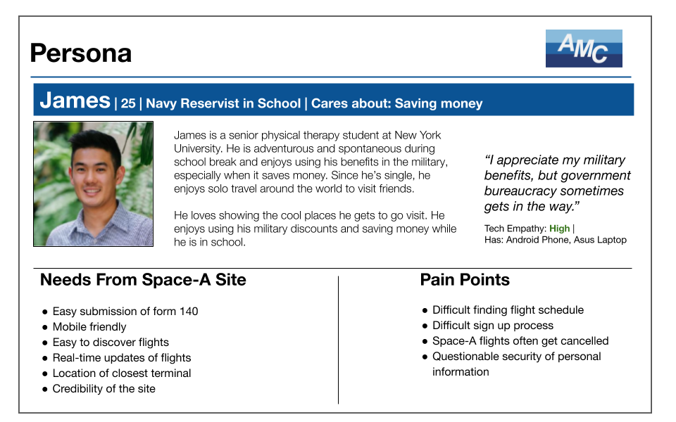
Persona
Phase 2: Develop Solutions
Secure Login
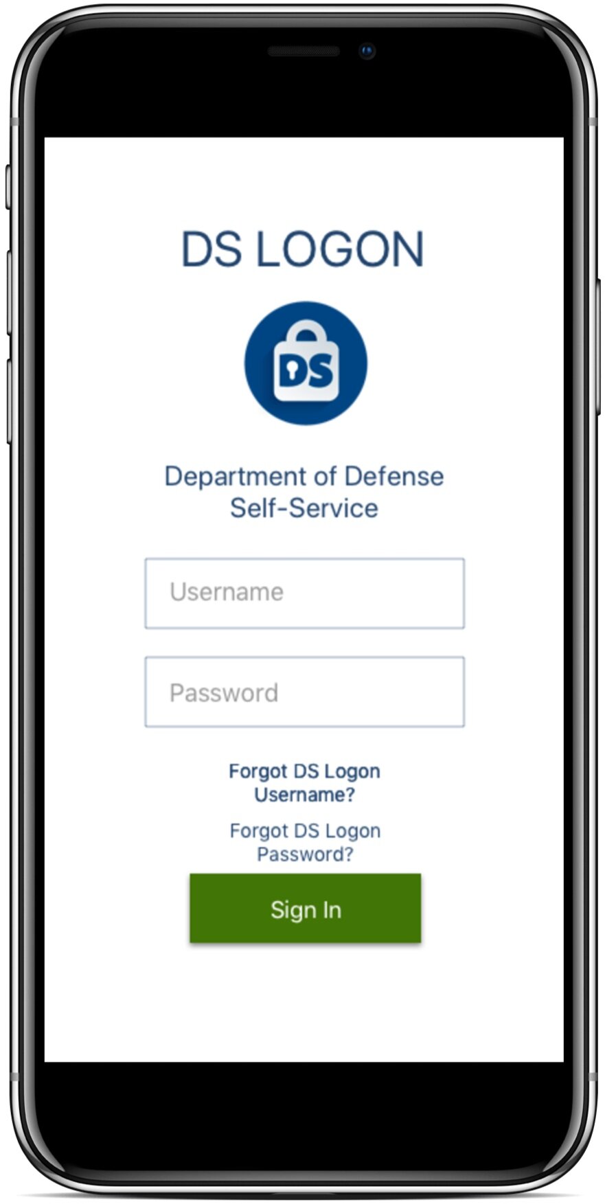
Before drawing up any sketches, we wanted to first work out some of the technical aspects of how the app would function. Based on our interviews and testing, we already knew that users wanted more details about flights, but the terminal was not allowed to post the details on Facebook because of security. Additionally, we wanted the process for applying for travel to as simple as possible. The solution we found for these issues was to have users sign in with DS Logon, a secure ID provided by the Department of Defense to all service members. This was a convenient way to verify that all of our users would have a military background, thus eliminating the issue of flight information security. As an added bonus, DS Logon also stores a variety of data that can be pulled directly into our app which includes the user's:
- Name
- Date of Birth
- Rank
- Military Branch
- Leave Status
- List of Dependents
Easy Document Submission
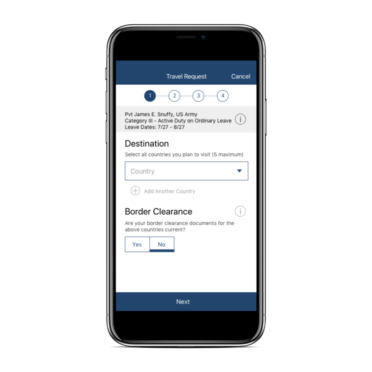
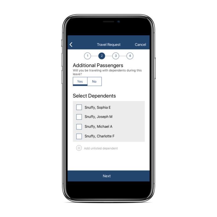
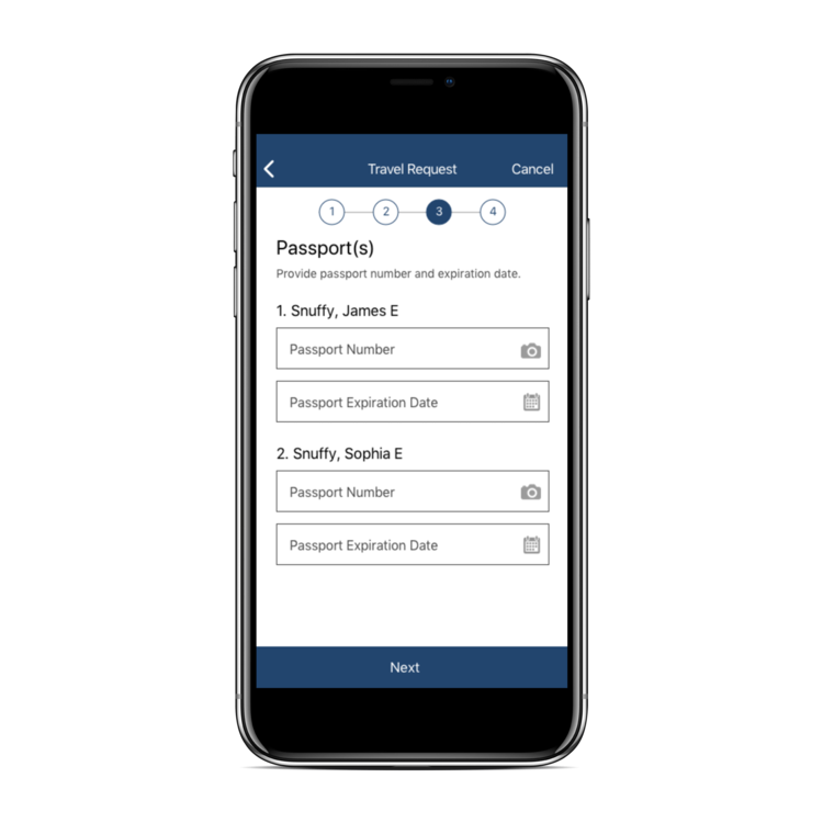
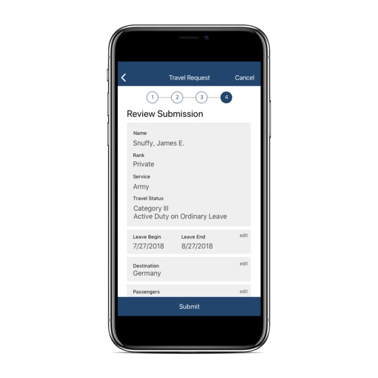
One of the most important pieces of this project was streamlining the process of filling out the "Form 140" used for travel requests. This document is essential for users to be able to use the service, so making it as easy as possible to fill out was quite important. Since the user's data can be used from DS Logon and Leave Web, the app will be able to autofill some of the fields as well as skip certain sections. Because of this, we decided to create a user flow diagram to map out the possible screens that could appear during the form depending on the user's leave status, military rank, etc.

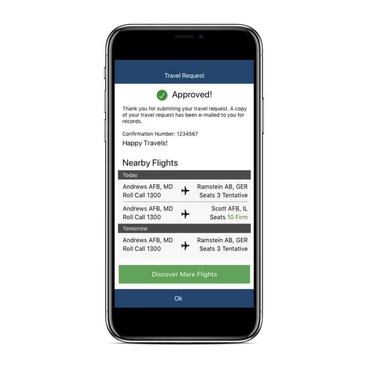
The resulting form we created (shown in the gallery below) pulls information from DS Logon, allowing the user to input only a few details. The user's name, rank, leave status, and dependents are auto-populated into the form, allowing for an easy submission. All the user needs to do then is fill out the country of origin, the dependents they will be traveling with, and the relevant passport information. If the user doesn't plan to leave the country or travel with dependents, the form essentially fills itself out.

<
Browse for and request flights
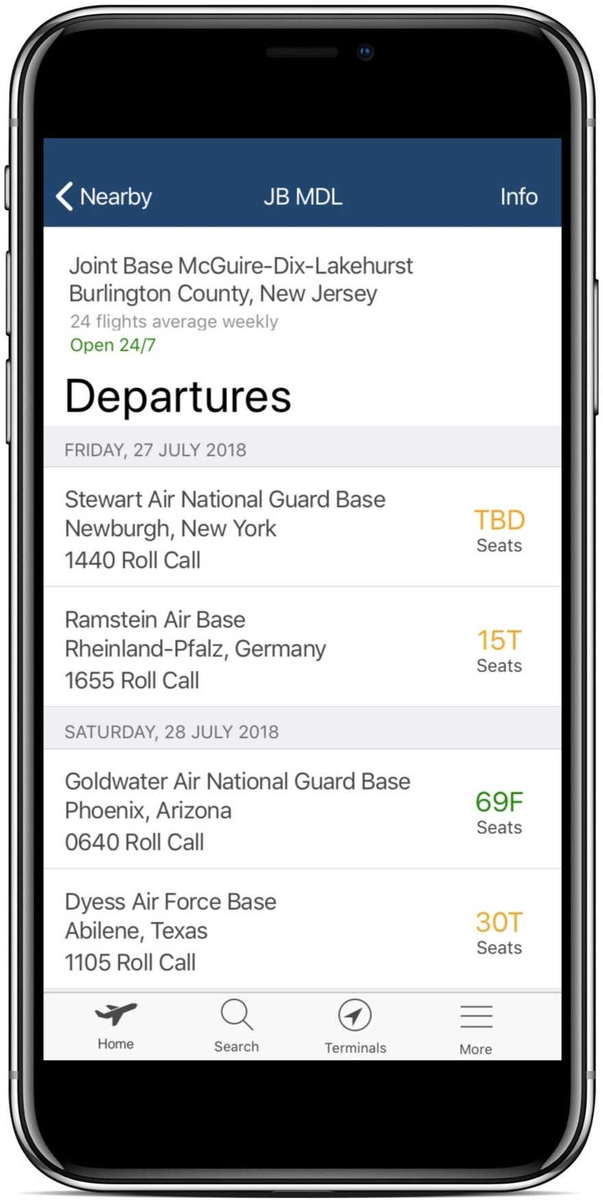
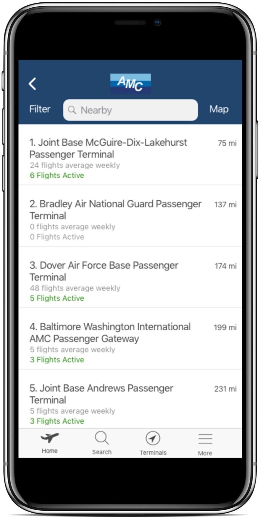
Our goal in creating a process for searching flights was to mimic the look and feel of apps made for commercial airlines while working under the restrictions of the Space-A process. Unfortunately, allowing users to search for a specific route to and from cities like a normal airline would be nearly impossible given the low volume of flights and the distance between terminals. For this reason, it made more sense to allow users to browse flights by terminal rather than by a traditional to-and-from search function.
Our research showed that users of Space-A are already quite knowledgeable about the terminals in the areas they typically travel, so this system makes sense to them. Additionally, they often use Space-A for leisure travel and will choose their location based on departures from the closest few terminals, so this system would allow them to easily see what is available nearby.
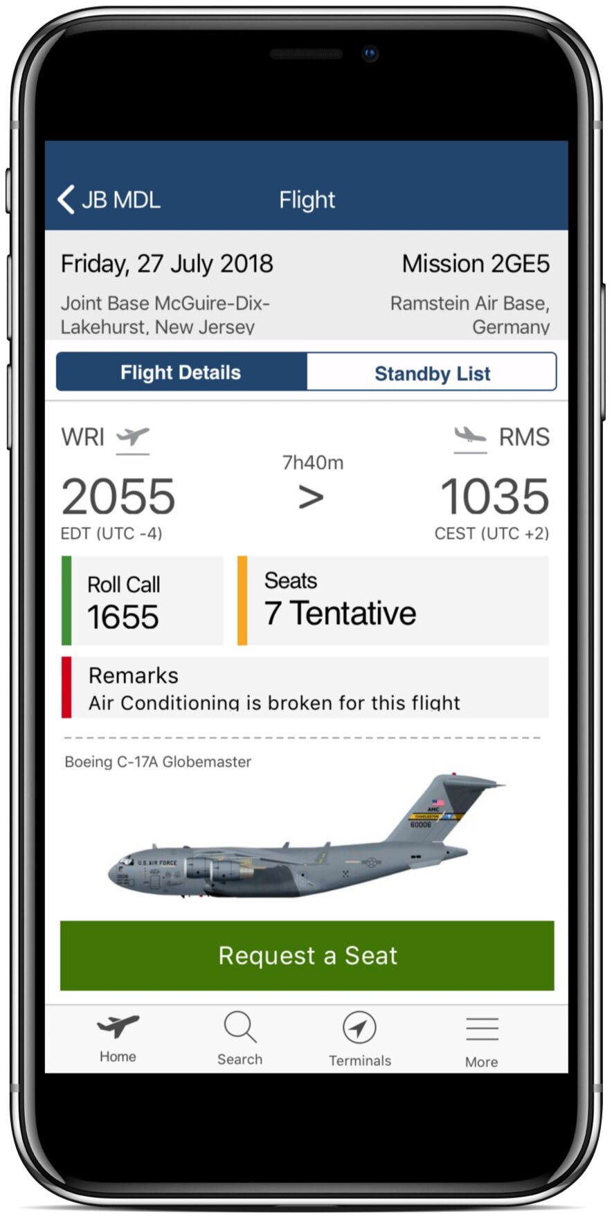
In order to get a seat on a Space-A flight, users must request a seat and understand their chances getting aboard based on the standby list. The nature of this service is such that there are no guarantees and nobody is allowed to book a definitive seat. This is a restriction in the system that we could do nothing about. What we could do, however, was provide as much information as possible to users to help them understand their chances.
- Realtime standby lists
- Number of seats (and whether they are firm or tentative)
- List of similar flights upon requesting a seat on a nearly full flight
- Info about the aircraft (as some are hightly unconvensional cargo plans not suitable for all types of passengers)
Information at a glance
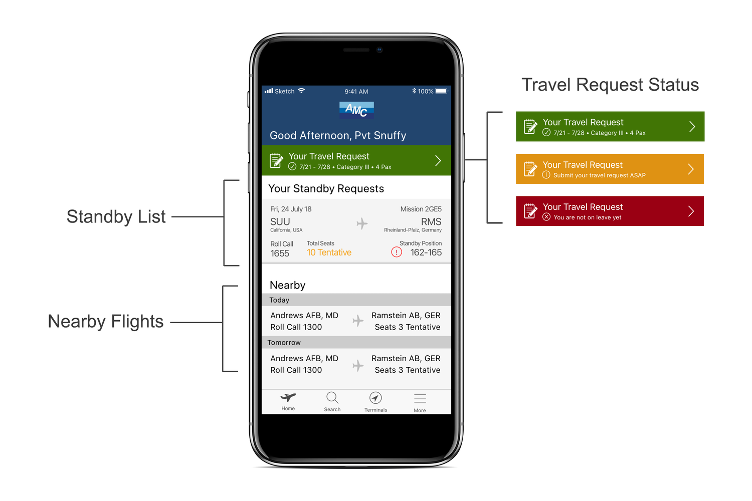
After developing the major features of the app, we worked on tying it all together with a home screen. We wanted this screen to provide only the most important information for users at a glance. The key elements of this page include:
- Travel request status - Notification of request status with call to action to submit form
- Nearby flights - A list of nearby flights based on the user's location and requested travel destinations
- Standby requests - Users get peace of mind with a list of all flights the user has requested seats on. The user will be notified with a red indicator if their seat position falls below the expected cutoff
Previous
Next
TO TOP
