Overview
About the Project
Mt. Cleverest is an ed tech platform that uses machine learning and natural language processing to catalog reading resources and generate assessment questions. The platform, which is currently in its beta form, aims to become a “textbook built by robots.” However, Mt. Cleverest still needs to grow substantially in order to reach this goal, so the focus of our work was on making the existing site more valuable for new users.
The developers of Mt. Cleverest asked my team and me to focus on making the platform more approachable and usable to early adopters of the platform. To accomplish this goal, we focused on making the user interface (UI) more understandable to new users and on communicating the current and future value of the platform to early adopters.
What I did
- Interviewed grade school teachers to learn about their day-to-day challenges and how they use tech to solve them
- Performed usability tests of the existing beta site
- Drafted Sketch wireframe mockups of the redesigned site
Goals
- develop trust with users who might be wary of artificial intelligence (AI) technology
- create an onboarding process to help new users to understand the platform in its beta state
- encourage users to add their own resources to grow the platform
Challenges
- Although Mt. Cleverest will ideally be a site populated with a multitude of user-generated resources, it’s initial users will need to find value from a smaller pool of content.
- Similarly, the machine learning algorithm will improve the user experience over time but may not be useful at first.
Phase 1: Discover
We began our project by conducting research to better understand the site's problems and our potential user base's needs. Our research consisted of the following:
- Interviews with potential users
- Usability tests of the existing site
- Competitive analysis of similar platforms
User Interviews
We started our research by interviewing 11 school teachers over the phone about their teaching habits and their use of technology in the classroom. In doing so we wanted to get a baseline understanding of how tech is used in the classroom and what might cause teachers to choose Mt. Cleverest over other platforms.
We were specifically interested in the following:
- How do teachers assess their students?
- How do teachers decide which online tools to use?
- Where do teachers find supplemental resources for their classrooms?
Key Insights
- Among the many tools and resources available online, our users gravitated towards sites like Newsela, Quizlet, Khan Academy, Kahoot, Desmos, and Nearpod, which help teachers create engaging assessments, provide content for students, and easily grade and track scores.
- Most teachers did not feel that any one tool was sufficient, and instead tend to jump between multiple tools throughout the school year.
- Users are open to discovering new content on a variety of websites, as long as they feel like the source is trustworthy and accurate.
- Many of our users also mentioned that they like to share resources with other teachers.
- They wanted to know what other teachers successfully use in their classrooms.
- We also found that teachers who create their own assessments typically draw inspiration from a variety of sources, often modifying and editing questions from already-made quizzes and tests, such as past state exams and Sparknotes.
- Our users across the board found that grading takes up the majority of their time, especially when trying to provide actionable feedback to students.
Usability Testing of the Existing Site
In addition to interviews, we also conducted usability tests of the existing beta site to see how users understood what was already live. We had users start from the site’s homepage with only the instruction that they were checking out a new teaching tool. Their task was to find out what the tool did and how they might use it in a classroom.
Key Insights from Usability Testing
- Users were confused lack of consistency between the wording on the homepage calling the site a “Textbook built by robots” and what they actually found once they entered the site. While Mt. Cleverest’s creators' intention is to create an open source textbook, the product doesn't fully deliver on that promise yet.
- Users thought the input field to add an article URL was a search bar.
- Users expressed distrust in seeing Wikipedia used as a resource so frequently.
- Users had difficulty understanding the mechanisms of creating a quiz, including what happened when you add a question.
- Users did not understand what happened to their question after adding it, particularly that the question stayed attached to the resource for other teachers use.
- When creating a quiz, users did not understand where the questions came from when an article they selected had pre-populated questions.
- Users were also confused by the quiz creation process. They didn't know where the questions came from and where they would be led to when they clicked “assign quiz.”
- We found that the expectations of the users after reading the copy on the welcome page did not match up with what they found when they clicked the “check it out” call to action.
In general, users were excited about the concept, but skeptical about the delivery. While the question creation itself was not difficult, users did not understand the full value of the product. They were excited about the idea of the technology behind the product, but struggled to understand its practical application.
Additionally, most users did not understand that they could add their own content in the search bar. Users were confused about why the site pulled primarily Wikipedia articles in response to their search queries and commented that they would not want to use Wikipedia articles as teaching materials.
Competitive Analysis
In order to avoid reinventing the wheel, we took some time to look at what other ed tech platforms do to onboard new users. The following chart demonstrates the features that different platforms have. While designing Mt. Cleverst’s platform, this was a useful tool to reference to look for inspiration from other platforms mentioned by teachers in our interviews.

Phase 2: Define
Having completed our initial research, it was time to synthesize our findings into a more actionable plan for design. During this phase of the process, our goal was to take all of the raw information we gathered and focus it toward defining the exact problem we wanted to solve with the site.
Affinity Mapping
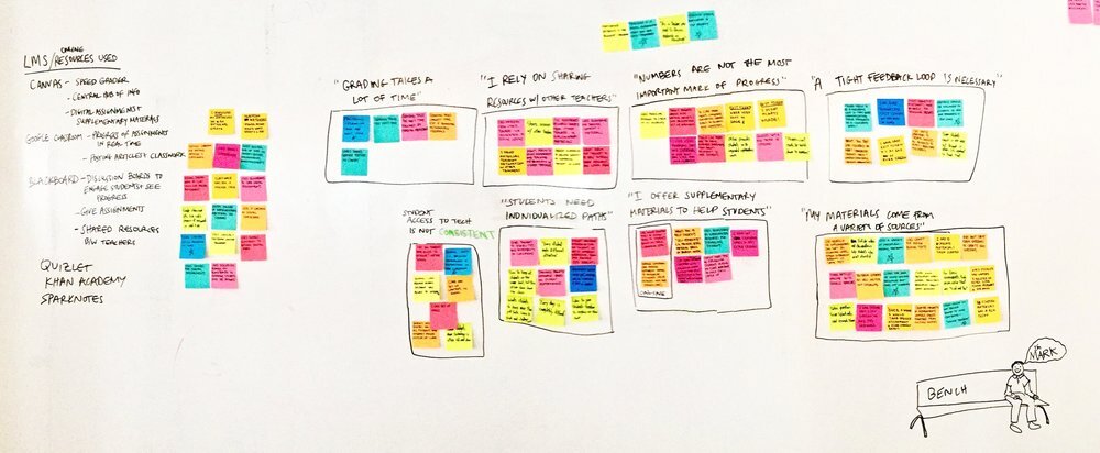
In order to make clearer sense of the information gathered during our research, we decided to create an affinity map of key insights. We grouped the insights and quotes from users together into categories that would help us to pin down the main pain points and needs of our user base.
Persona
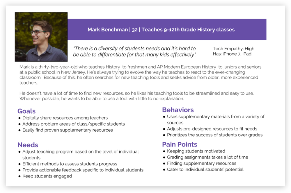
We developed Mark Benchman as an amalgamation of all of our user interviews. He is still relatively new to teaching so he doesn’t have a tried and true system and he likes incorporating technology into his classroom to keep things fresh.
Most of the teachers we spoke to were mid-20s to 30s and already had used some sites comparable to Mt. Cleverest to manage their classrooms, find lessons, and create quizzes. They are familiar with edtech tools and are always looking for ways to reduce their time spent planning and grading, but also for support from other teachers. We didn't have enough data from those 11 interviews to validate that teachers would be interested in AI, but we could validate that teachers want to feel supported so that they can in turn be supportive of their students’ different needs.
Problem Statement
The developers of Mt. Cleverest want their platform to be a massive source of free, online educational materials that are catalogued and assessed by AI "robots."
However, to create a site that achieves the developers' goals would require users to help build the end product by uploading their own resources. Most teachers are too busy to help out with such a lofty, long-term goal unless they are able to find value in the site in its current state.
"How might we help new users of Mt. Cleverest to find value from adding resources and creating quizzes on the beta site so that they will help to populate the site with a wide volume of content?"
Phase 3: Develop
Starting Simple
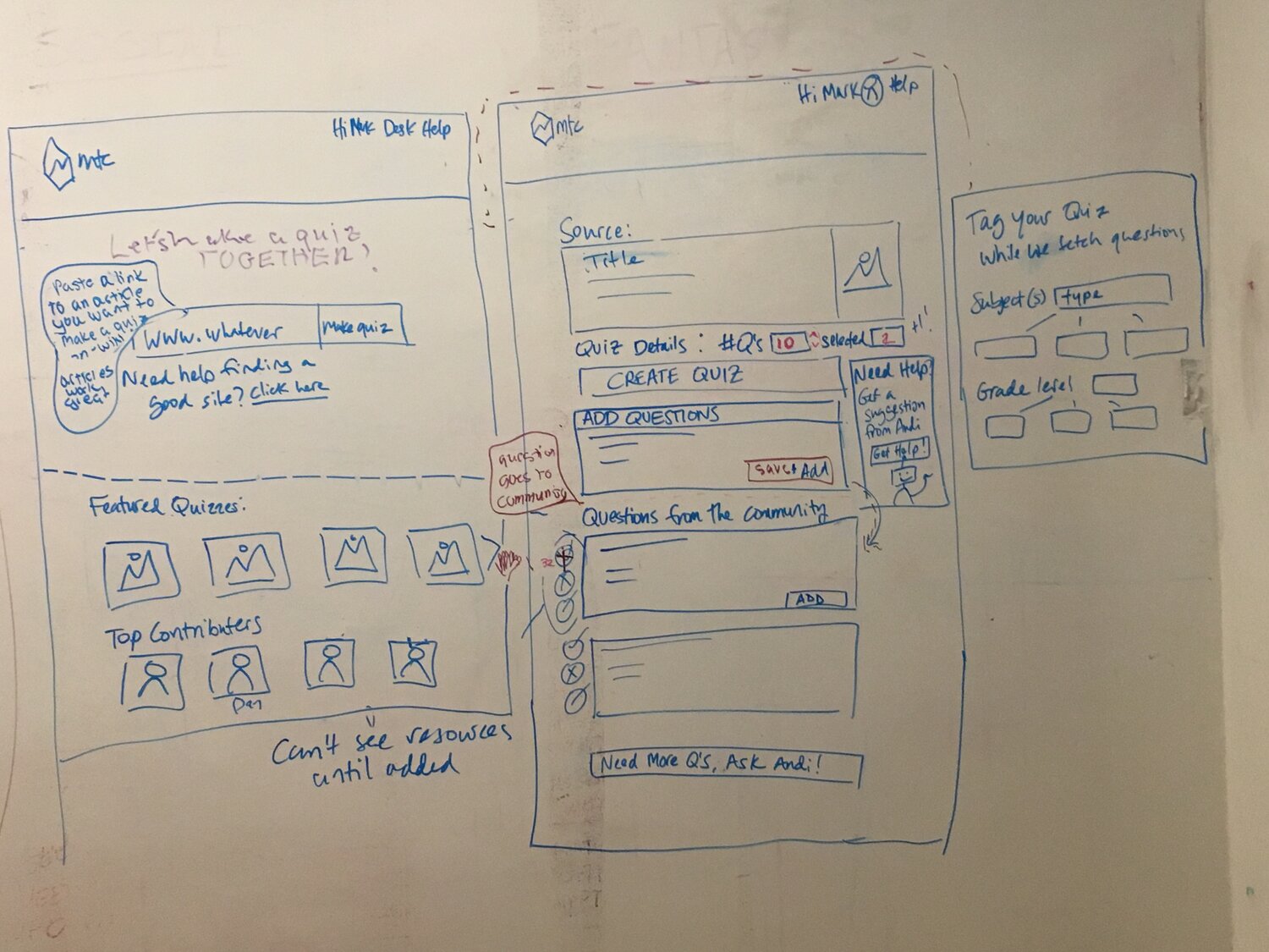
The first step of our ideation process was to work together as a team on a design studio to make pen-and-paper sketches of basic concepts for the pages we wanted to change as well as pages we planned to add to the site. The session covered the following pages:
- The site's homepage
- A progressive onboarding process
- An "desk" page for teachers to store resources and quiz results
- A quiz creation page
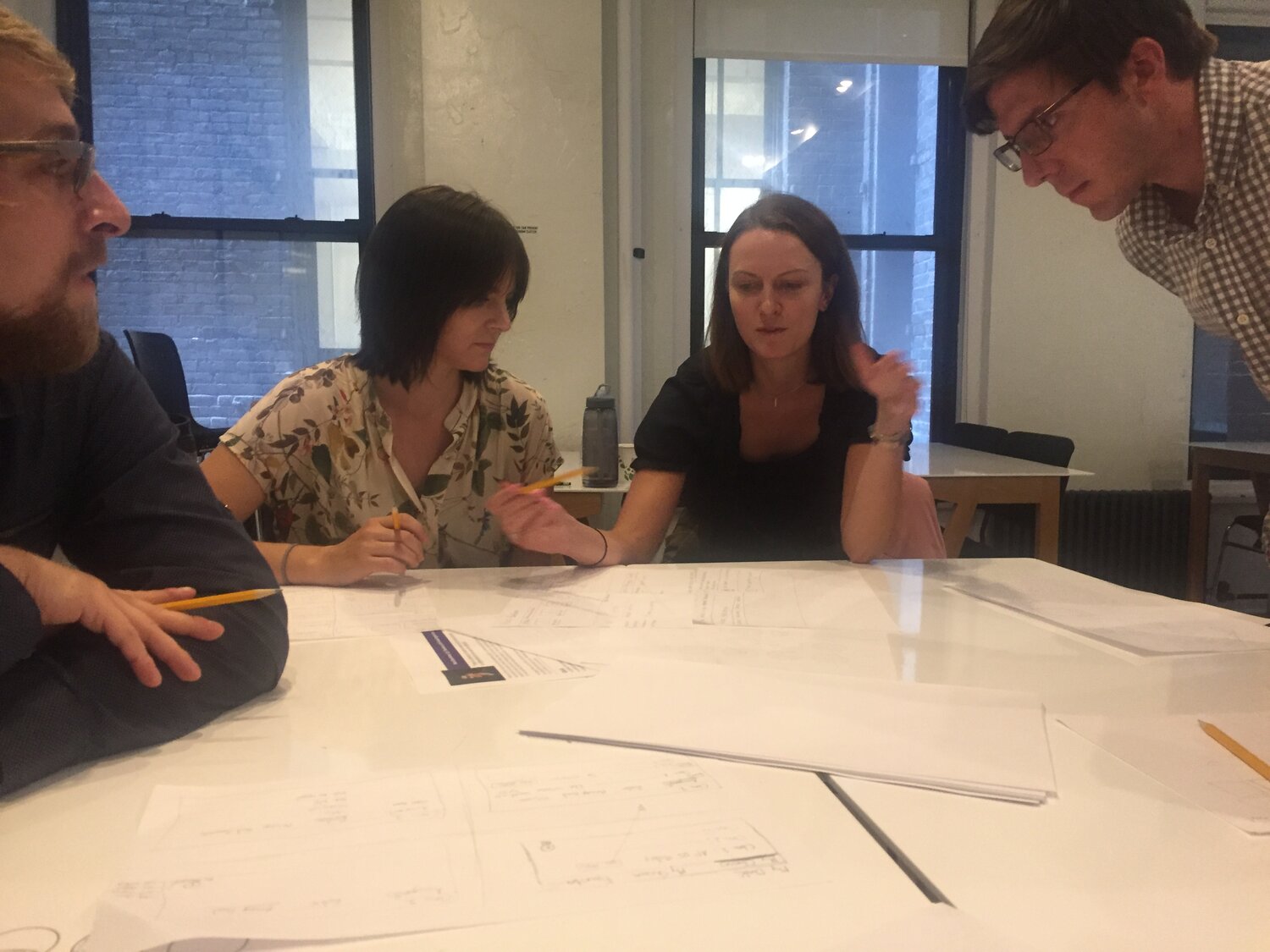
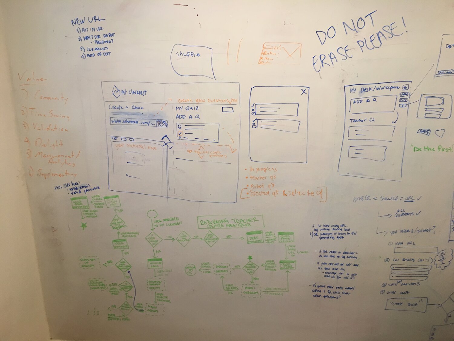
With the ideas from the design studio, we got together at the whiteboard to decide on the exact direction we wanted to go with each idea and to make adjustments to our initial concepts.
Onboarding
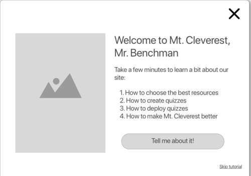
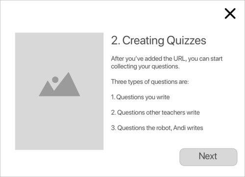
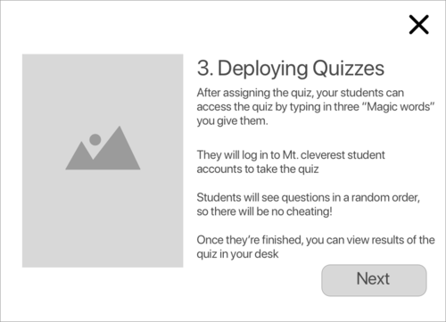
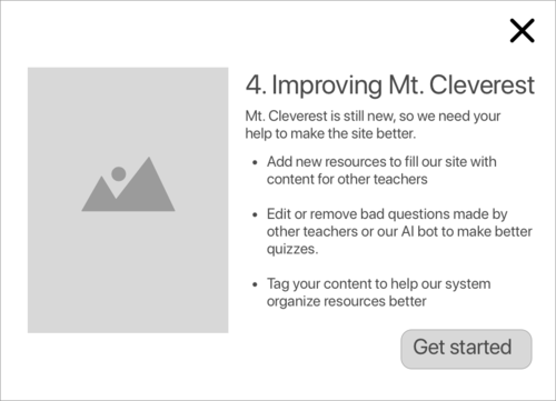
The first part of the site we wireframed for testing was a progressive onboarding process that would give new users step-by-step instructions on how the site worked. The informational pop-up gave users a brief overview of the site, how to use the site, and ways that early adopters could help to make the site better.


<
In testing, we found that half of our users opted to simply skip the popup and move directly into the site. Despite the slight disappointment of the pop-up not having the desired effect, it did give us an interesting insight into the effectiveness of the content displayed to new users. It helped us to contrast between those who followed the onboarding and those who did not. We found that users who followed the onboarding process had a better understanding of the overall function of the site and its goals, but they were not able to perform any better on the task provided.
We considered this an informative success, but a functional failure. Having learned more about how users might learn to accomplish the desired task, we decided to take a new approach to teach new users about the site.
Our second attempt to onboard new users was to provide information to the user during each task by way of a tool-tip helper. The robot helper (shown in the Home page section below) was designed to guide a new user through the process of creating a quiz. We believed that users were overloaded with too much information early on with the progressive onboarding and did not remember the specifics of how the site worked once they reached the quiz creation process. With Andi, they were reminded of key details of the site such as that some of the questions were created by other users and the AI, which would reduce confusion when seemingly random questions were added to a draft quiz.
In testing, we found that users were much more easily able to complete the task of creating a quiz. However, they did indicate that they became a bit annoyed by the robot by the end of the process. We noted this, and decided to provide the means to deactivate tool tips in our next iteration.
Home page
The first design for a homepage we came to was one with the global search and a url input split (as opposed to the developers’ original design that had just one bar for both of these things). Below this was a list of resources added by other users that a teacher could browse to find teaching materials..
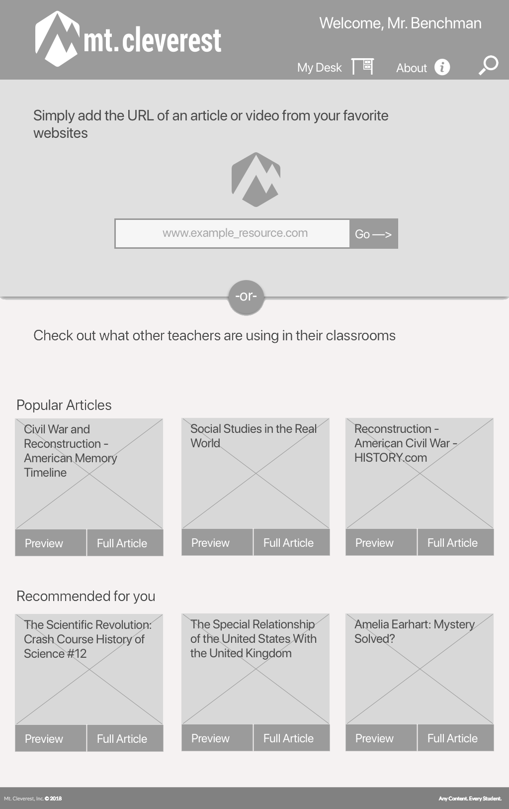
In testing, we found that there was confusion with this design since the copy on the page did not clearly demonstrate what a user was supposed to do with either section. Since we were attempting to avoid a progressive onboarding process based on our previous testing, we wanted to make the page speak for itself, so we came to this new design.
In our next iteration of this page, we added or reorganized the following elements:
- Copy was written to clarify that the user would create quizzes from resources they add
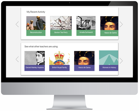
- Content was organized into blocks to more clearly delineate between the user's option to add new resources or work based on previous users' resources
- Andi the robot was added to give character to the text telling users what to do
- A status bar was added that would fill when users performed actions that would teach the AI, incentivizing them to choose those actions more frequently
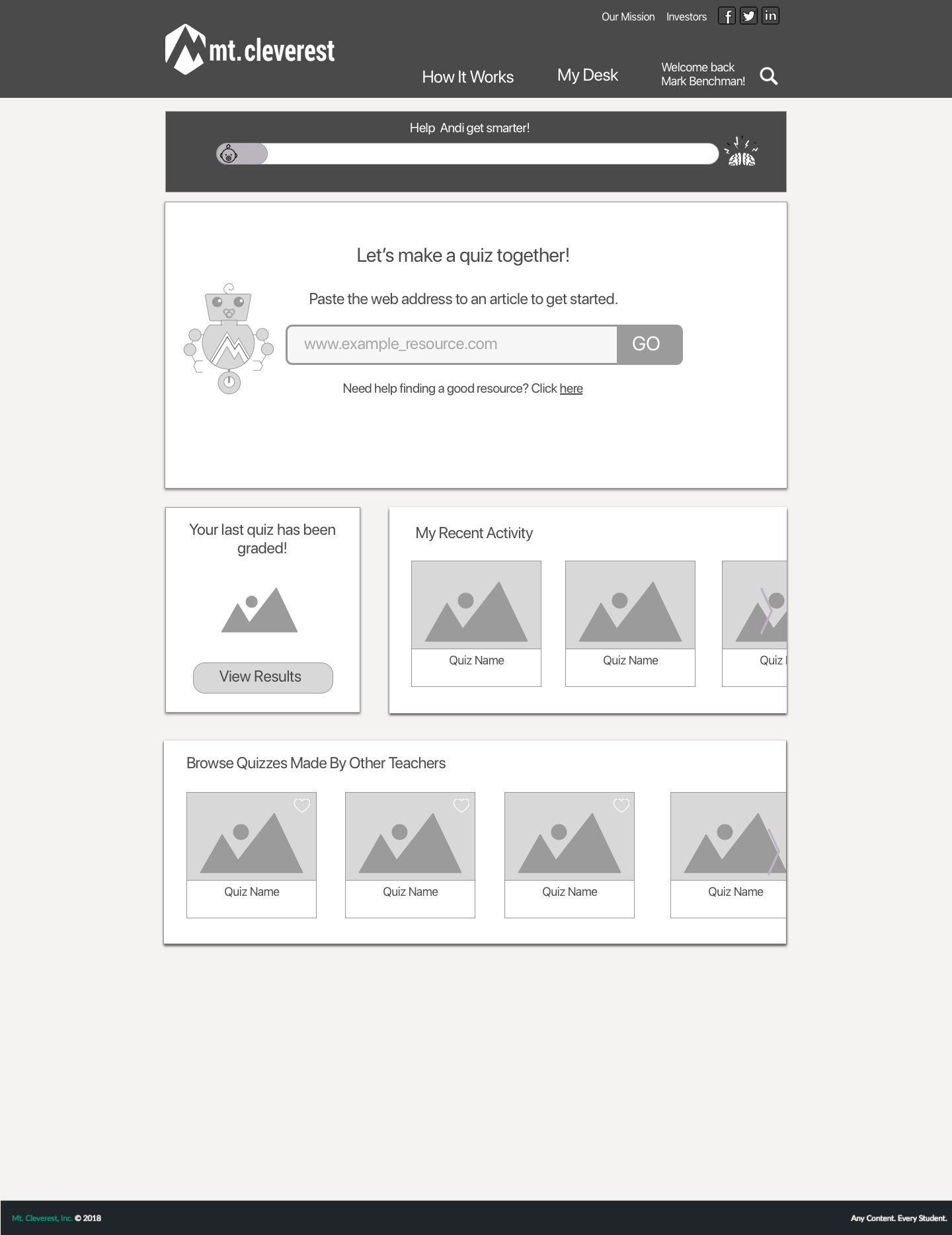
In testing we found that this page layout gave users a better understanding of the functionality of the site. They realized now that the articles they added were for the purpose of making online quizzes.
Satisfied that the interface of the page had been made more understandable, we opted to add color and images to the mockup to make a high fidelity prototype of our plans. In this iteration, we also moved the content blocks to give equal weight to recent activity and content added by other users.
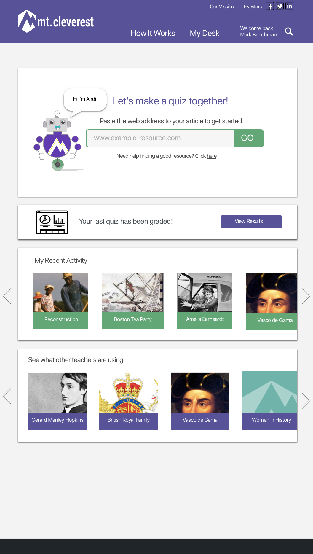
Based on our testing of the status bar for Andi's progress, we found that users were simply confused by it's inclusion on the page. While we were unsure whether that type of visual incentive to help the algorithm could be useful, we decided to remove it for the sake of simplicity,
Welcome page for new users
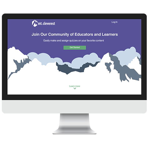
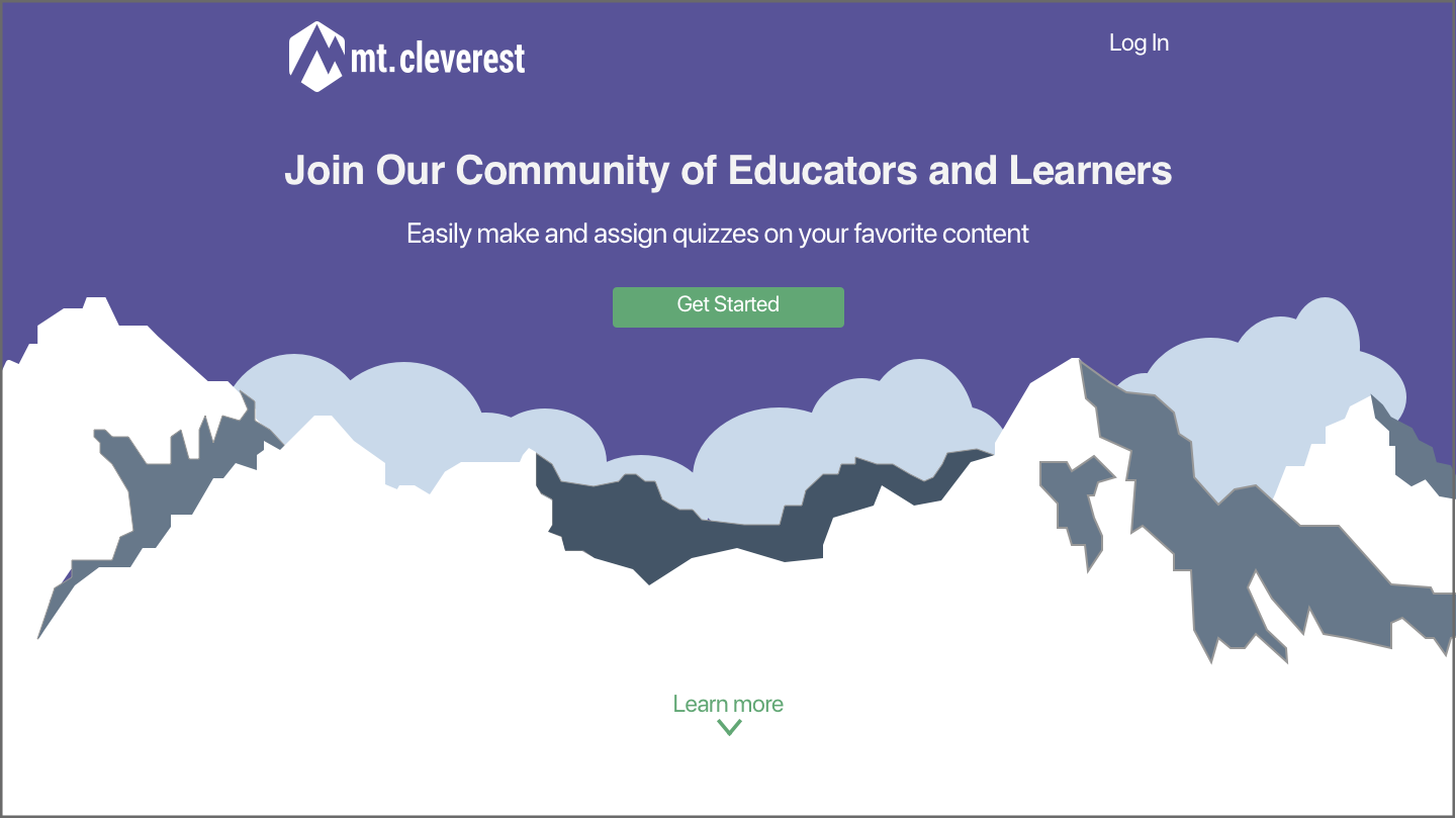
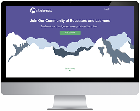
Based on our interviews and usability testing, we decided that the first page new users would see should be updated to better achieve the developers' goals. Specifically, we wanted to make sure the welcome screen was focused toward potential users of the site rather than potential investors. For this reason, we decided to leave out some of the more technical, machine learning copy that served as a selling point for investors, but confused potential users.
View the whole page hereWe found from our testing that users were confused by the concept of a "textbook built by robots" as the primary description for the website in its current state. While this is ideally the direction the developers want to take the site, its beta form is unable to deliver on that promise given the low volume of content currently available.
Instead, we drew from our insights from teachers to focus on the community aspect of an open-source textbook and the time-saving features of quiz questions generated by AI. In this way, we hoped to focus the short-term goals of the site on solving problems teachers have with sharing resources with each other and finding time to create and grade quizzes while also incentivizing them to add content to the site and generate questions to train the AI algorithm.
During our testing of other pages, we decided to revisit the welcome page to add a bit more information to better initiate users into the Mt. Cleverest community. In addition to simply listing the steps required to use the site, the page now informs users of how they can interact with the site be improve the experience for themselves and others. We also added color and visuals to give the site an inviting first impression.
View the whole page hereQuiz Creation Page
In our initial testing of the current beta site, we found that users had a hard time understanding the interface of the quiz creation process.
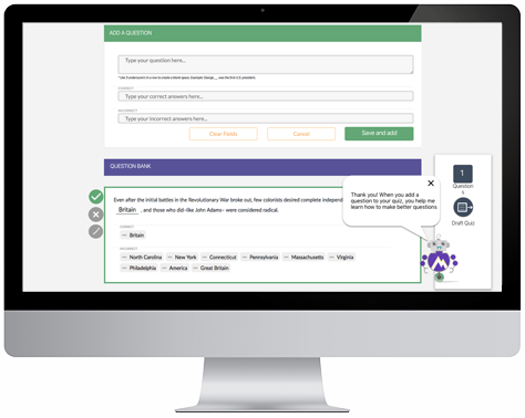
In our first redesign of this page, we focused on adding visual indicators and text to guide the user into understanding the process. We added the following:
- Indicators to show which questions are made by the user and which ones are AI generated
- A tally of the number of questions currently added to the quiz
- A button to "draft" a quiz where the original site said "assign"
- A tooltip helper to explain the community and AI elements
- Clearer buttons for selecting, deselecting, and editing existing questions
- The ability to share and favorite quizzes
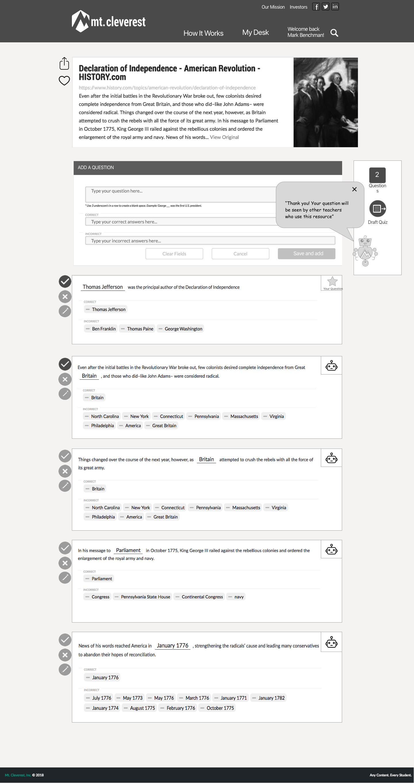
Our testing of this page proved to be quite successful with users experiencing little to none of the same confusion as the existing site.
Two problems still remained after this redesign, however:
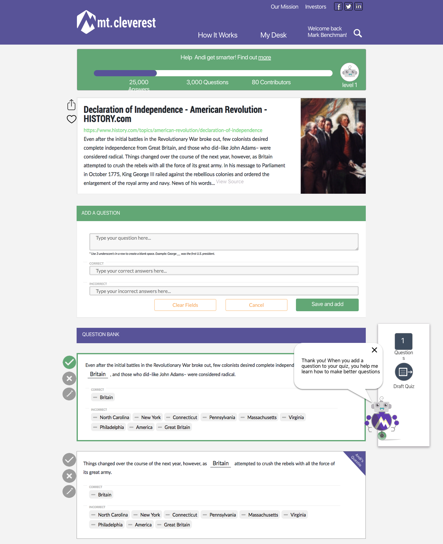
- Users had trouble understanding the icons used to represent questions generated by the AI
- Users now understood how many questions were added to the quiz, but they couldn't easily identify which ones were selected
To solve these problems we made the indicators for AI questions have a clearly labeled text flag and placed a highlighted box around questions that were selected for the quiz. At this point, we were satisfied that these changes would solve the issues, so we also updated the page to have color and images for final mockups.
Desk Page
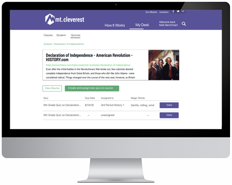
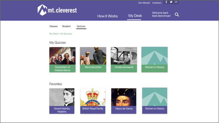
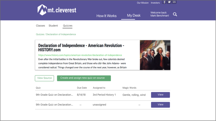
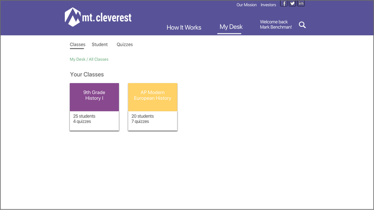
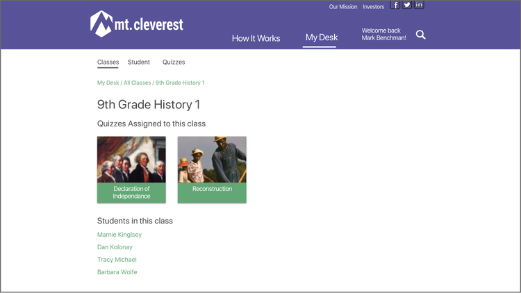
Mt. Cleverest's original design for a desk page had a single section that included past results from quizzes. Our goal in redesigning the page was to provide a more organized space for teachers to keep the resources they use on the site and to track their students' progress.

<
To to this, we split the desk into three sections: classes, students, and quizzes. This separation allows teachers to see the materials they use for each class, track individual students' results, and keep a repository of all of the sources they've used or plan to use in the future. Due to time constraints, we were unable to run any user tests on this page to understand how users would interact with the page. These mockups were made to show the developer what a more comprehensive desk page could look like. Ideally, this section of the site would include analytics to provide teachers with a more objective metric of students' progress.
Phase 4: Deliver
List of final deliverables
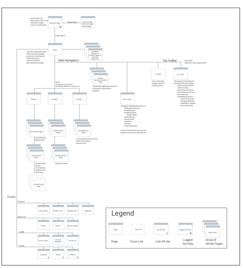
- Detailed specification document (annotated wireframes, user flows, sitemap)
- Research report
- Clickable InVision prototype
- 30-minute presentation to stakeholders
- High fidelity mockups of redesigned screens
Site Map
Ideas For Next Steps
1) Upvoting
Since we learned that teachers tend to find resources through community, we believe a worthwhile feature to integrate into Mt. Cleverest would be a social component through which teachers could like or upvote quizzes. This would help to bring the best resources to the front of the site and would give teachers a more active role in shaping what they will see featured.
2) Data Visualization
From talking to teachers we found that they are less concerned with students' results on individual assessments and more interested in the trajectory of their progress. For this reason, we would like to add features into the desk page to show overall class data as well as student progression stats in addition to simply showing students' individual results on quizzes.
3) Content Taxonomy
Since Mt. Cleverest's stated goals is to be a "Textbook Built by Robots", it makes sense that it will be necessary to categorize, tag, and label all of the content currently on the site as well as all new content added. By creating a system for sorting resources by categories like grade level and subject, we could give Mt. Cleverst the functionality of a traditional textbook.
Previous
Next
TO TOP
